Page LayoutS2C Home « Page Layout
In lesson 6 of the CSS Advanced Tutorials we looked at dividing a webpage into sections using the <div> tag. In this lesson we expand on that knowledge to create a layout for our homepage. We will highlight the appropriate section of the proposal that will give us an idea of the layout and create the relevant CSS from this information.
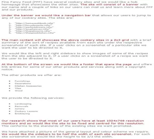
Fine Fancy Food's Website Proposal Revisited
Areas that affect page layout are highlighted in red.

Deciphering our highlighted text
Ok, let's go through our highlighted text and see what we can glean from the proposal for our layout.
1) The site will consist of a banner.
We can just set up the basic CSS for this for now.
2) Under the banner we would like a navigation bar .
We can just set up the basic CSS for this for now.
3) Our research shows that most of our users have at least 1024x768 resolution monitors and so would like the site to be fixed and centred for this resolution.
The customer is asking for a fixed width layout that is centred. We covered the CSS of how to do this in CSS Advanced Tutorials - Lesson 6 - Layout. The more interesting statement here is the mention of 1024x768 resolution. When Laying out a page at this resolution there is a grid system using a width of 960 pixels which fits that resolution very neatly. 960 is divisible by 2, 3, 4, 5, 6, 8, 10, 12, 15, 16, 20, 24, 30, 32, 40, 48, 60, 64, 80, 96, 120, 160, 192, 240, 320 and 480. This means 960 is a highly flexible base number to work with, when creating the columns for our website. Visit 960 Grid System for more information about this. So we have now decided that our webpage will be 960 pixels wide.
4) We would like the sidebars to be half the width of each site screenshot.
So the total width of the sidebars will be the same as a site screenshot.
5) The main content will showcase the above cookery sites in a 2x3 grid.
So we have 2 site screenshots going across the main content area of the webpage and we already know the sidebars are the same width as 1 site screenshot. So we can divine the widths of the sidebars from this by dividing 960 by 3. This means the main content is 640 wide and the sidebars in total are 320, therefore each sidebar will be 160 pixels wide.
6) At the bottom of the screen we would like a footer that spans the page, so this will be 960 pixels wide.
We can just set up the basic CSS for this for now.
Creating Our Layout
We now have enough information to create the basic layout for our site with CSS. We will put borders around our divisions for now, so we can see the layout, we can remove these later.
Ok, with Notepad or a simlilar text editor open, copy and paste the following CSS into the editor.
/* *** Reset browser styles *** */
h1, h2, p, div, ul, ol, li, code, pre, html, body {
  margin: 0;
  padding: 0;
  font-size: 100%;
  font-weight: normal;
}
/* wraps entire contents of page */
#wrapper {
  margin: 0 auto;
  background-color: #add8e6;
  border: 1px solid black;
  width: 960px;
}
/* setup basic banner css */
#banner {
  position: relative;
}
/* setup basic nav css */
#nav {
  background-color: #4169E1;
  width: 100%;
}
/* wrap main content */
#contentwrapper {
  clear: both;
  position: relative;
  width: 100%;
}
/* left sidebar */
#leftsidebar {
  margin: 5px;
  position: absolute;
  top: 0px;
  bottom: 40px;
  left: 0;
  width: 160px;
}
/* right sidebar */
#rightsidebar {
  margin: 5px;
  position: absolute;
  top: 0px;
  bottom: 40px;
  right: 0;
  width: 160px;
}
/* footer bar */
#footer {
  clear: both;
  width: 960px;
}
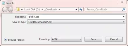
Click file from the toolbar and then click the save option.
In the Save in: tab at the top make sure you are pointing to the _CaseStudy folder we created above.
In the File name: text area type global.css and then click the Save button and close the Notepad.

The .css file extension lets the system know that this is a cascading stylesheet document, you must save the file with this extension so your default web browser knows what the file is for.
Reviewing The CSS
The first thing we do is reset browser styles for our tags then we create a wrapper for the whole page using the #wrapper style. The margin: 0 auto; centres the page in the middle of the screen and we are using a light blue background (#add8e6). We have set a width for the page which will remain constant regardless of screen size. We then set a royal blue background (#4169E1) for our navigation bar and set some CSS for our other divisions.
Creating Our HTML
Reopen up the file with Notepad we created in Lesson 1: Website Proposal.
You saved the file to your computer in the C:\_CaseStudy folder as index.html
Copy and paste the following code into the reopened file, between the opening </body> and closing </body> element.
<div id="wrapper">
  <div id="banner">
  </div>
  <div id="nav">
  </div>
  <div id="contentwrapper">
    <div id="main">
    </div>
    <div id="leftsidebar">
    </div>
    <div id="rightsidebar">
    </div>
    <div id="footer">
    </div>
  </div>
</div>
Save the file in the C:\_CaseStudy folder and close the Notepad.

Viewing Our Saved File
Well although we have setup some initial CSS and HTML we haven't added any content so there is no screenshot to show.
Reviewing The Code
The reason we have no screenshot above is that all the divisions we set up are empty. Of course we could set a height but better to avoid this property for page layout, We could also add some borders to show the layout but we would have to remove them later. As we go through the lessons we will see our divisions fill out and I think it gives a better understanding while teaching the case study :).
Lesson 2 Complete
In this lesson we have reviewed the proposal and retrieved information to give us our basic page layout.
Related Tutorials
HTML Intermediate Tutorials - Lesson 2 - HTML Structure - Layout
CSS Basic Tutorials - Lesson 8 - Padding & Margins
CSS Basic Tutorials - Lesson 9 - Borders
CSS Intermediate Tutorials - Lesson 1 - Backgrounds
CSS Intermediate Tutorials - Lesson 2 - A Final Look At The Box Model
CSS Intermediate Tutorials - Lesson 7 - Positioning
CSS Advanced Tutorials - Lesson 6 - Layout
What's Next?
In the next lesson we extract the information from the proposal that is relevant to the creation of a banner.