Swing ComponentsS2C Home « Swing Components
In this lesson we take a look at several of the interactive Swing components available for use when creating our GUIs that users are most familiar with, such as buttons, check boxes, text fields etc.
All the interactive components we need to create a GUI extend from the javax.swing.JComponent class with each class inheriting characteristics from its JComponent, Container
and Component superclasses. Lets start by taking a look at the JButton component which is used for making clickable buttons.
The javax.swing.JButton ClassTop
As discussed in the Swing Containers lesson in the Panes section we can add components directly to the content pane of our frames, via a reference
to another pane, or to a panel that is added to the frame. Lets see an example of adding a JButton to a reference of the content pane:
import javax.swing.JFrame;  // An interactive window
import javax.swing.JButton; // An interactive button

public class JButtonFrame extends JFrame {
    // Construct the frame
    public JButtonFrame() {
        super("The JButton Component");
        setBounds(300, 200, 568, 218);
        setDefaultCloseOperation(JFrame.EXIT_ON_CLOSE);
        setVisible(true);
    }

    public static void main (String[] args) {
        JButtonFrame jbf = new JButtonFrame();
        // Create a JButton
        JButton jb = new JButton("An example of a JButton");
        // Add the JButton to the content pane of the frame
        jbf.getContentPane().add(jb);
    }
}
The following screenshot shows the results of compiling and running the JButtonFrame class. The button we have created fills the entire content area of our JFrame as we haven't specified any
dimensions. Clicking the button doesn't do anything as we haven't set up any listeners for handling the click event which will be discussed in the Event Handling lesson.
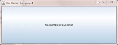
Following is another example where we create two buttons and position them within the default layout manager for a frame, which is BorderLayout.
import javax.swing.JFrame;  // An interactive window
import javax.swing.JButton; // An interactive button
import java.awt.*; // AWT Toolkit

public class JButtonFrame2 extends JFrame {
    // Construct the frame
    public JButtonFrame2() {
        super("The JButton Component");
        setBounds(300, 200, 568, 218);
        setDefaultCloseOperation(JFrame.EXIT_ON_CLOSE);
        setVisible(true);
    }

    public static void main (String[] args) {
        JButtonFrame2 jbf2 = new JButtonFrame2();
        // Create 2 buttons
        JButton jb1 = new JButton("JButton 1");
        JButton jb2 = new JButton("JButton 2");
        // Add the buttons directly to two regions of the BorderLayout of the frame
        jbf2.add(BorderLayout.NORTH, jb1);
        jbf2.add(BorderLayout.SOUTH, jb2);
    }
}
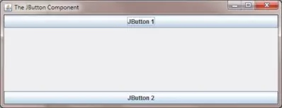
The following screenshot shows the results of compiling and running the JButtonFrame2 class. The buttons we have created are added directly to the north and south regions of the
BorderLayout layout manager regions of the frame. From now on when we are adding components to the content pane of a frame we will generally just add
them directly to the frame rather than via a reference using the getContentPane() method.
The javax.swing.JCheckBox ClassTop
Check boxes allow a user to select one or more items for selection or deselection. This type of component is a good choice when all the options are known in advance to present to the user. The following example shows some checkboxes we can select and deselect.
import javax.swing.JFrame; // An interactive window
import javax.swing.JCheckBox; // An interactive check box
import javax.swing.JPanel; // A container for our check boxes
import java.awt.*; // AWT Toolkit

public class JCheckBoxFrame extends JFrame {
    // Construct the frame
    public JCheckBoxFrame() {
        super("The JCheckBox Component");
        setBounds(300, 200, 568, 218);
        // Create some check boxes
        JCheckBox jcb1 = new JCheckBox("One", true);
        JCheckBox jcb2 = new JCheckBox("Two", false);
        JCheckBox jcb3 = new JCheckBox("Three", true);
        JCheckBox jcb4 = new JCheckBox("Four", false);
        // Put the check boxes in a column in a panel
        JPanel checkBoxPanel = new JPanel(new GridLayout(0, 1));
        checkBoxPanel.add(jcb1);
        checkBoxPanel.add(jcb2);
        checkBoxPanel.add(jcb3);
        checkBoxPanel.add(jcb4);
        // Add panel to our frame
        add(checkBoxPanel, BorderLayout.BEFORE_LINE_BEGINS);

        setDefaultCloseOperation(JFrame.EXIT_ON_CLOSE);
        setVisible(true);
    }

    public static void main (String[] args) {
        JCheckBoxFrame jcbf = new JCheckBoxFrame();
    }
}
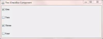
The following screenshot shows the results of compiling and running the JCheckBoxFrame class. Each check box is created individually with a value and a flag. When the flag is set to true
the check box initially appears ticked (selected). When the flag is set to false the check box initially appears unticked (deselected). We use a GridLayout
to place each check box into a JPanel panel. We then relatively position the panel using a constant from the BorderLayout and display the frame.
The javax.swing.JComboBox ClassTop
Combo boxes display a drop-down list when clicked on, to offer our users a choice of options to select from. We can also set up combo boxes to accept input that is added to the drop-down list. The following example displays a drop-down list when clicked on.
import javax.swing.JFrame; // An interactive window
import javax.swing.JComboBox; // A drop-down list
import java.awt.*; // AWT Toolkit

public class JComboBoxFrame extends JFrame {
    // Construct the frame
    public JComboBoxFrame() {
        super("The JComboBox Component");
        setBounds(300, 200, 568, 218);
        // Create an array of strings
        String[] someNumbers = { "One", "Two", "Three", "Four", "Five" };
        //Create the combo box
        JComboBox jcombobox = new JComboBox(someNumbers);
        //Select string "four" (index 3 as arrays zero-index based)
        jcombobox.setSelectedIndex(3);
        // Add the JComboBox to the content pane of the frame
        add(jcombobox, BorderLayout.BEFORE_FIRST_LINE);

        setDefaultCloseOperation(JFrame.EXIT_ON_CLOSE);
        setVisible(true);
    }

    public static void main (String[] args) {
        JComboBoxFrame jcbf = new JComboBoxFrame();
    }
}
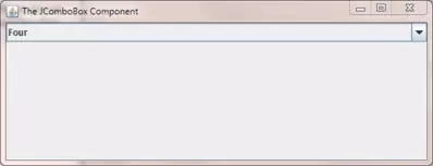
The following screenshot shows the results of compiling and running the JComboBoxFrame class. We populate the drop down list of the combo box from an array of strings and set the initial index for
the combo box to 3. When we run the code the string "Four" is always displayed in the frame and you can then select another option from the drop down list to display that value. We then relatively position the
panel using a constant from the default layout manager for a frame, which is the BorderLayout and display the frame.
The javax.swing.JRadioButton ClassTop
A radio button is analagous to radio buttons on a radio where you can only click one button at a time to tune into a particular radio station. It is common practice when creating GUIs to place radio buttons we want to select from in a bordered panel so users can clearly see these radio buttons are grouped together. The following example puts some radio buttons into a bordered panel to highlight to the user that these particular buttons are grouped.
import javax.swing.JFrame; // An interactive window
import javax.swing.JRadioButton; // A radio type button
import javax.swing.ButtonGroup; // Group our radio buttons
import javax.swing.JPanel; // A container for our check boxes
import javax.swing.BorderFactory; // Factory class
import java.awt.*; // AWT Toolkit

public class JRadioButtonFrame extends JFrame {
    // Construct the frame
    public JRadioButtonFrame() {
        super("The JRadioButton Component");
        setBounds(300, 200, 568, 218);
        // Create some radio buttons
        JRadioButton jrb1 = new JRadioButton("One");
        JRadioButton jrb2 = new JRadioButton("Two");
        JRadioButton jrb3 = new JRadioButton("Three");
        JRadioButton jrb4 = new JRadioButton("Four");
        // Group the buttons so only one can be selected at a time
        ButtonGroup pickNumber = new ButtonGroup();
        pickNumber.add(jrb1);
    	pickNumber.add(jrb2);
    	pickNumber.add(jrb3);
    	pickNumber.add(jrb4);
        // Put the radio buttons in a column in a bordered panel
        JPanel radioButtonPanel = new JPanel(new GridLayout(0, 1));
        radioButtonPanel.setBorder(BorderFactory.createLineBorder(Color.red));
        radioButtonPanel.add(jrb1);
        radioButtonPanel.add(jrb2);
        radioButtonPanel.add(jrb3);
        radioButtonPanel.add(jrb4);
        // Add panel to our frame
        add(radioButtonPanel, BorderLayout.BEFORE_LINE_BEGINS);

        setDefaultCloseOperation(JFrame.EXIT_ON_CLOSE);
        setVisible(true);
    }

    public static void main (String[] args) {
        JRadioButtonFrame jrbf = new JRadioButtonFrame();
    }
}
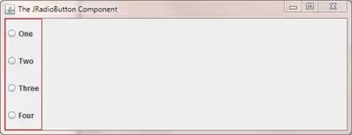
The following screenshot shows the results of compiling and running the JRadioButtonFrame class when the frame is first displayed. We create individual radio buttons and then group them together
using the ButtonGroup class so only one radio button can be pressed at a time. We then create a red bordered panel and add the radio buttons to it. We then add the panel to our frame. If you compile
and run the code yourself you will see that only one radio button can ever be selected at a time.
The javax.swing.JTable ClassTop
Computer users are familiar with data being displayed in a tabular format in rows and columns. In Swing we use the JTable component to display data in a tabular format. The following example
uses one of the two JTable constructors that accept direct input into a table. The constructors have some disadvantages such as making every field in a table editable. You can create your own table
models to avoid these issues and we will talk more about this in the Case Study section of the site.
import javax.swing.JFrame; // An interactive window
import javax.swing.JScrollPane; // A scrollable pane to attach JTable to
import javax.swing.JTable; // An editable text field
import java.awt.*; // AWT Toolkit

public class JTableFrame extends JFrame {
    // Construct the frame
    public JTableFrame() {
        super("The JTable Component");
        setBounds(300, 200, 568, 218);

        // Create some row and column data
        String[] tableColumns = {"Name", "Sex", "Age", "Class", "Teacher"};
        Object[][] tableRows = {
            {"John", "M", new Integer(22), "Maths", "Mr. Goldstein"},
            {"Charlie", "F", new Integer(18), "English", "Mrs. Smith"},
            {"Jim", "M", new Integer(28), "Physics", "Mr. White"},
            {"Mary", "F", new Integer(32), "Cookery", "Mr. French"},
            {"Ashley", "F", new Integer(25), "German", "Miss Eckles"}
        };
        // Create a JTable
        JTable jt = new JTable(tableRows, tableColumns);
        // Add a JScrollPane containing our table to the content pane
        this.getContentPane().add(new JScrollPane(jt));

        setDefaultCloseOperation(JFrame.EXIT_ON_CLOSE);
        setVisible(true);
    }

    public static void main (String[] args) {
        // Create a frame
        JTableFrame jtf = new JTableFrame();
    }
}
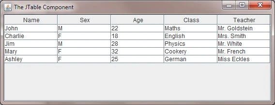
The following screenshot shows the results of compiling and running the JTableFrame class. Our data is displayed in a readable tabular format. As pointed out above, one of the possible drawbacks
of direct input through one of the JTable constructors is that all the fields are editable. If you run the code and focus a field you can overtype any data cell in the table. A point of interest is
that we don't attach our JTable directly to the frame but via a JScrollPane. If you do attach the JTable directly to the frame the code will still work but you will lose the table headings.
The javax.swing.JTextField ClassTop
A text field allows a user to unsurprisingly add text to a field we create. In the following example we add a text field, set some initial text and set focus on the field for user input.
import javax.swing.JFrame; // An interactive window
import javax.swing.JTextField; // An editable text field
import java.awt.*; // AWT Toolkit

public class JTextFieldFrame extends JFrame {
    // Construct the frame
    public JTextFieldFrame() {
        super("The JTextField Component");
        setBounds(300, 200, 568, 218);
        // Create a text field
        JTextField jtf = new JTextField(20);
        // Put some initial text into the field
        jtf.setText("Type in something!");
        // Set focus on the field
        jtf.requestFocus();
        // Add the text field to the content pane of the frame
        add(jtf, BorderLayout.BEFORE_FIRST_LINE);

        setDefaultCloseOperation(JFrame.EXIT_ON_CLOSE);
        setVisible(true);
    }

    public static void main (String[] args) {
        JTextFieldFrame jtff = new JTextFieldFrame();
    }
}
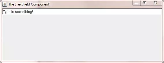
The following screenshot shows the results of compiling and running the JTextFieldFrame class when the frame is first displayed. The cursor is focused at the start of our text field and the text
has been set to the value we coded using the setText() method. We can modify the contents of the text field as well as it is editable.
There are a lot of other interactive Swing components but we can't cover them all here and will leave this as an exercise for you to look into at your leisure.
Lesson 4 Complete
In this lesson we looked at some of the interactive lightweight Swing components.
What's Next?
We have seen several code examples where we use layout managers to position our Swing components without going into details about the layout manager used. In the next lesson we rectify this by taking an in-depth look at several layout managers we can use to organise the components within our GUIs.