LayoutS2C Home « Layout
At the heart of web design is page layout and before we even begin cutting the code it's good practice to sit down with a pencil and paper and work out a layout for the data we wish to present. There are several things to consider when creating a layout such as the monitor width and the content we wish to display. There are two widely used layout styles for approaching these issues, fixed-width and liquid.
Liquid layouts make full use of the screen and expand or contract as the screen is resized. This might sound great but with the advent of ever increasing monitor widths, text can become stretched. This can make displaying your content tricky at different screen sizes and so is dependant on what you are displaying.
Fixed width layouts are the most widely used layout methods present on the web today. These of course also have their drawbacks. On small width monitors the user may have to use scroll bars to see your full content. On very wide monitors the user will see a lot of blank canvas on their screens. The upside is that your display remains constant regardless of screen size. In this lesson we will focus on fixed-width layouts.
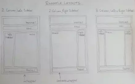
Some Sketched Layouts

The above sketch just gives three examples of the many layouts available, the notations for each box could be easily translated into divisions using the <div> HTML tag.
There are different ways to create fixed-width layouts, for example using floats or margins. In this tutorial we will use margins and some divisions to create the three column layout, which is the rightmost layout in the sketch above.
Open up the file with Notepad we created and tested in Lesson 5: Navigation.
You saved the file to your computer in the C:\_CSSAdvanced folder as lesson_5_csspage.html
Copy and paste the following code into the reopened file, overwriting the existing text.
<!DOCTYPE html>
<!-- Our HTML/CSS for Navigation follows -->
<html  lang="en">
<head>
<title>Advanced CSS - Lesson 6 - Layouts</title>

<style type="text/css">
/* wraps entire contents of page */
#wrapper {
  margin: 0 auto;
  border: 1px solid black;
  background-color: yellow;
  width: 950px;
}
#banner {
  position: relative;
}
#banner h1 {
  text-align: center;
}
/* nav */
#nav {
  background-color: olive;
}
#nav ul {
  list-style: none;
}
/* wrap main content */
#contentwrapper {
  clear: both;
  position: relative;
  width: 100%;
}
#main {
  background-color: orange;
  border: 1px solid black;
  margin-left: 160px;
  margin-right: 160px;
}
#main .filler {
  margin-bottom: 600px;
}
#leftsidebar {
  background-color: fuchsia;
  border: 1px solid black;
  top: 0px;
  bottom: 26px;
  left: 10px;
  width: 140px;
  position: absolute;
}
#rightsidebar {
  background-color: aqua;
  border: 1px solid black;
  top: 0px;
  bottom: 26px;
  right: 10px;
  width: 140px;
  position: absolute;
}
#footer {
  background-color: blue;
  color: white;
  margin-top: -10px;
  margin-bottom: -16px;
}
</style>
</head>

<body>
  <div id="wrapper">
    <div id="banner">
      <h1>Some Banner Content</h1>
    </div>
    <div id="nav">
      <ul>
        <li>Navigation Links Go Here</li>
        </ul>
    </div>
    <div id="contentwrapper">
      <div id="main">
        <p class="filler">Main Content Goes Here</p>
      </div>
      <div id="leftsidebar">
        <p>Left Sidebar Content</p>
      </div>
      <div id="rightsidebar">
        <p>Right Sidebar Content</p>
      </div>
      <div id="footer">
        <p>Footer Content</p>
      </div>
    </div>
  </div>
</body>
</html>
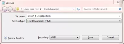
Save the file in the C:\_CSSAdvanced folder as lesson_6_csspage.html and close the Notepad.

Viewing Our Saved File
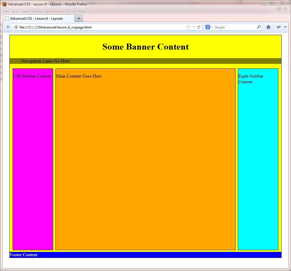
From the C:\_CSSAdvanced folder, double click on the saved file and it will appear in your default web browser and look something like the following image.

Reviewing The Code
The first thing we do is to create a wrapper for the whole page using the #wrapper style. The margin: 0 auto; centres the page in the middle of the screen and we are using a yellow background. The background is just there so you can see the other divisions layered on the wrapper. We have set a width for the page which will remain constant regardless of screen size.
We set the #banner division relative to the containing element which is the #wrapper division.
After this we style the navigation bar. This chapter is just showing layout, for a rundown on navigation bars see CSS Advanced Tutorials - Lesson 5 - Navigation.
We set each sidebar to the left and right using some positioning elements. Look at CSS Intermediate Tutorials - Lesson 7 - Positioning for an in-depth view of positional CSS properties.
The main content window just sits between the sidebars and there is enough room to accomodate the sidebar margins. Always remember these are added to the width of an element to ascertain the total width.
Finally we have a footer that sits underneath everything else. We use negative margins here to set the footer right at the end of our content.
Lesson 6 Complete
To turn this into a liquid layout we could just remove the width CSS property from the #wrapper style. Have a go at this and see the results when changing the screen size. Also play around with the CSS to create the other two layouts sketched above.
Related Tutorials
HTML Intermediate Tutorials - Lesson 2 - HTML Structure - Layout
HTML/CSS Case Study - Lesson 2 - Page layout
What's Next?
Its normal practice for users to want to print content from your site, but what might look great on screen may look terrible on paper. Also using half an ink cartidge may deter users from printing information from your site again. In the next lesson we learn how to create a printed page with breaks and all.