Finishing The Box ModelS2C Home « Finishing The Box Model
In lessons 7, 8 and 9 of the CSS Basic Tutorials we looked at the box model, and the padding, margin and border properties which form the periphery of the box model. In this lesson we take a final look at the box model by exploring box model dimensions. We look at all the CSS box model dimension properties and see the impact these have on our images and text.
Box Model Dimension CSS Properties
height
Specifies the content height for a box model element.
min-height
Specifies a minimum content height for a box model element.
max-height
Specifies a maximum content height for a box model element.
width
Specifies the content width for a box model element.
min-width
Specifies a minimum content width for a box model element.
max-width
Specifies a maximum content width for a box model element.
line-height
Specifies the minimal height of line boxes within the element.
vertical-align
Specifies the vertical positioning inside a line box for boxes generated by an inline-level element.
Viewing Box Model Dimension Properties
Lets see some examples of using the above box model dimension CSS properties.
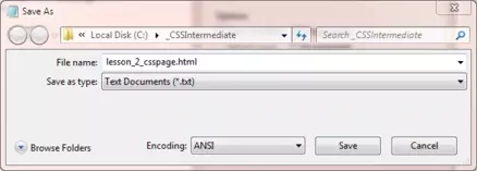
Open up the file with Notepad we created and tested in Lesson 1: Backgrounds.
You saved the file to your computer in the C:\_CSSIntermediate folder as lesson_1_csspage.html
Copy and paste the following code into the reopened file, overwriting the existing text.
<!DOCTYPE html>
<!-- Our HTML/CSS for Box Model Dimensions follows -->
<html  lang="en">
<head>
<title>CSS - Lesson 2 - A Final Look At The Box Model</title>

<style type="text/css">

/* Set minimum and maximum height and width for the body element */
body {
  background-color: orange;
  min-height: 300px;
  max-height: 800px;
  min-width: 500px;
  max-width: 750px;
}

/* Float a div to the right */
div {
  background-color: white;
  float: right;
  height: 100px;
  width: 150px;
  overflow: auto;
}

/* Set height and width for our images */
img {
  margin: 10px;
  padding: 10px;
  border: 1px solid black;
  height: 150px;
  width: 200px;
}

#img1 {
  vertical-align: text-top;
  height: 75px;
  width: 100px;
}

#img2 {
  vertical-align: text-bottom;
  height: 75px;
  width: 100px;
}

#para1 {
  line-height: 15px;
}

#para2 {
  line-height: 30px;
}

</style>

</head>
<body>
<h1>CSS Box Model Dimension Properties</h1>
<h2>Setting Height and Width Properties</h2>
<p id="para1" >Image height and width using generic img style. Line height set to
15px. Image height and width using generic img style.  Line height set to 15px.
<img src="https://server2client.com/images/beefalepiesmall.jpg"
    alt="Beef and Ale Pie"></p>
<p id="para2" >Line height set to 30px. Line height set to 30px.
Line height set to 30px. Line height set to 30px. Line height set to 30px.
Line height set to 30px. Line height set to 30px.</p>
<h2>Image with vertical-align of text-top</h2>
<p>
<img id="img1" src="https://server2client.com/images/fishpiesmall.jpg"
    alt="Fish Pie">Look at the vertical alignment of the text.</p>
<h2>Image with vertical-align of text-bottom</h2>
<p>
<img id="img2" src="https://server2client.com/images/fishpiesmall.jpg"
    alt="Fish Pie">Look at the vertical alignment of the text.</p>
<div>
<p>Some filler text.Some filler text.Some filler text.Some filler text.
Some filler text.Some filler text.Some filler text.Some filler text.
Some filler text.Some filler text.</p>
</div>
</body>
</html>
Save the file in the C:\_CSSIntermediate folder as lesson_2_csspage.html and close the Notepad.

Viewing Our Saved File
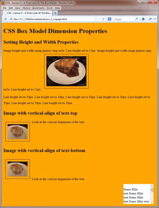
From the C:\_CSSIntermediate folder, double click on the saved file and it will appear in your default web browser and look something like the following images. We have used two screenshots here to show the entire screen.
When you cut and paste the code, adjust the screen size to see the effects of the dimension settings.

Reviewing The Code
The width and height CSS properties allow us to set the dimensions for the content part of a box element. When calculating overall width and height remember to include any margins, padding and borders in your calculations.
There are some gotchas when using the height CSS property and text. Remember that a user can change the font size that they view text in within their browser so when inserting text in a box with a particular height make sure you use the overflow CSS property to deal with this.
The min and max height/width properties allow us to set a finite size for our boxes or as in this case the whole viewable screen (via the body element).
The other CSS properties we used allow us to set a line-height giving us control over line spacing and the vertical-align property which allows us to set a vertical baseline for our content wherever we like.
Mess around with the CSS and change some of the style setting to see the effects differing dimensions have. Also try removing the overflow CSS property from our box and see the effects of changing the browser font size.
Related Tutorials
CSS Basic Tutorials- Lesson 7 - Understanding The Box Model
CSS Basic Tutorials- Lesson 8 - Padding & Margins
CSS Basic Tutorials- Lesson 9 - Borders
What's Next?
In the next lesson we we look at pseudo selectors, their purpose and how to use them.
CSS Reference
Box Model Dimensions
The height CSS Property
The min-height CSS Property
The max-height CSS Property
The width CSS Property
The min-width CSS Property
The max-width CSS Property
The line-height CSS Property
The vertical-align CSS Property