Main ContentS2C Home « Main Content
In this lesson we create the main content for our homepage. We will highlight the appropriate section of the proposal and look at the Fine Fancy Foods Layout Diagram. Along with the files sent to us by the client we will have the information required to create the main content part of our informational data.
Fine Fancy Food's Website Proposal Revisited
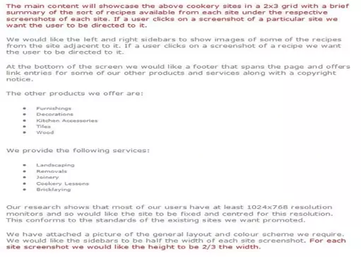
Areas that affect the main content are highlighted in red.
Deciphering Our Highlighted Text
Ok, let's go through our highlighted text and see what we can learn from the website proposal with regards to our main content.
1) The main content will showcase the above cookery sites in a 2x3 grid with a brief summary of the sort of recipes available from each site under the respective screenshots of each site. If a user clicks on a screenshot of a particular site we want the user to be directed to it.
Well we worked out in Lesson 2: Page Layout that the main content area is 640 pixels wide, in fact the grid content is repeated across a 2x3 grid, so there are six areas of similar content. This sounds perfect for a table that we can knock up with HTML and style with CSS.
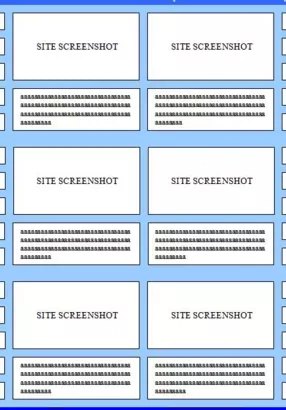
Let's look at the part of the diagram Fine Fancy Foods sent us that affects the main content area.
2) For each site screenshot we would like the height to be 2/3 the width.
We can see from the diagram that the grid areas have some space around them so we can introduce some padding around our screenshots. Lets make each sreenshot 300x200 pixels as this gives us a workable dimension and we keep the 2/3 rule for the height requested by the client.
We can think slightly ahead here as well for the sidebars and get a rough height for our text entry below each screenshot. It seems we can fit three 60 pixel high images vertically for each screen shot with 10 pixels padding in between to equal the 200 pixels height of each screenshot. From the diagram we can see that we also have 2 vertical sidebar images for each text entry. Some quick maths here ((60 x 2) + 10) gives us a height for our text area of 130 pixels.
Image and Text Files
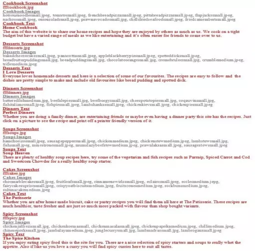
The image and text files from the proposal, that are required for the main content section, are highlighted in red.
Creating A Folder For Our Main Content CSS
It's often a good idea to seperate the main content area of a website, which changes a lot, from other areas of the screen into different CSS files and we will do that for this lesson.
Let's create a folder for our main content CSS
double click My Computer icon
double click C:\ drive (or whatever your local drive is)
double click the _CaseStudy folder
right click the mouse in the window
from the drop down menu Select New
click the Folder option and call the folder CSS and press enter.
Creating Our CSS For Our Main Content
Ok, with Notepad or a simlilar text editor open, copy and paste the following CSS into the editor.
Copy and paste the following CSS into the editor.
/* Style main content area */
#main {
 margin-left: 167px;
}
#main td {
 padding: 5px;
 padding-bottom: 0px;
}
#main td p {
  background-color: white;
  margin-top: -5px;
  border: 1px solid #ccf;
  width: 300px;
  height: 130px;
  overflow: auto;
}
Click file from the toolbar and then click the save option.
In the Save in: tab at the top make sure you are pointing to the CSS folder we created above.
In the File name: text area type main.css and then click the Save button and close the Notepad.
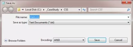
The .css file extension lets the system know that this is a cascading stylesheet document, you must save the file with this extension so your default web browser knows what the file is for.
Reviewing The CSS
We have set the left margin for our main content area slightly larger than the left sidebar to give us some space between the two areas. We are then just adding padding for our screenshots and creating an area for the text for each site. We have set an overflow to cope with text that is bigger than the text area. Of course for this amount of CSS it isn't really worth creating the extra CSS file but it gives you a feel for a real project I hope.
Creating Our HTML
Reopen up the file with Notepad we updated in Lesson 4: Navigation Bar.
You saved the file to your computer in the C:\_CaseStudy folder as index.html
Copy and paste the following code into the reopened file, between the opening <div id="main"> and closing </div> element.
<table>
  <tr><td><a href="http://homecookbook.info/">
        <img src="https://server2client.com/images/fffcookbook.jpg" alt="cookbook"
             width="300px" height="200px"></a></td>
      <td><a href="http://ilovedesserts.info/">
        <img src="https://server2client.com/images/fffdesserts.jpg" alt="desserts"
             width="300px" height="200px"></a></td>
  </tr>
  <tr><td><p><strong>Home Cookbook</strong><br />The aim of this website is to share
  our home recipes and hope they are enjoyed by others as much as us. We cook on a
  tight budget but have a varied range of meals as we like entertaining and it's often
  easier for friends to come over to us.</p></td>
  <td><p><strong>I Love Desserts</strong><br />Everyone loves homemade desserts
  and here is a selection of some of our favourites. The recipes are easy to follow and
  the dishes are pretty simple to make and include old favourites like bread
  pudding and spotted dick.</p></td>
  </tr>
  <tr><td></td></tr>
  <tr><td><a href="http://perfectdinner.info/">
        <img src="https://server2client.com/images/fffdinners.jpg" alt="dinners"
             width="300px" height="200px"></a></td>
      <td><a href="http://soupheaven.info/">
        <img src="https://server2client.com/images/fffsoups.jpg" alt="soups"
             width="300px" height="200px"></a></td>
  </tr>
  <tr><td><p><strong>Perfect Dinners</strong><br />Whether you are doing a family
  dinner, are entertaining friends or maybe even having a dinner party this site has the
  recipes. Just click on a picture to see the recipe and print off a printer friendly
  version of it.</p></td>
  <td><p><strong>Soup Heaven</strong><br />There are plenty of healthy soup
  recipes here, try some of the vegetarian and fish recipes such as Parsnip, Spiced
  Carrot and Cod and Sweetcorn Chowder for a  really healthy soup starter.</p></td>
  </tr>
  <tr><td></td></tr>
  <tr><td><a href="http://thepatisserie.info/">
        <img src="https://server2client.com/images/fffcakes.jpg" alt="cakes"
             width="300px" height="200px"></a></td>
      <td><a href="http://thespicekitchen.info/">
        <img src="https://server2client.com/images/fffspicy.jpg" alt="spicy"
             width="300px" height="200px"></a></td>
  </tr>
  <tr><td><p><strong>The Patisserie</strong><br />Whether you are after home made
  biscuit, cake or pastry recipes you will find them all here at The Patisserie. These
  recipes are much healthier, taste fresher and are just so much more packed with
  flavour than shop bought variants.</p></td>
  <td><p><strong>The Spice Kitchen</strong><br />If you enjoy eating spicy food this is
  the site for you. There are  a nice selection of spicy starters and soups to really
  whet the appetite. Also if like us you love a curry you will find spicy curries here
  to suit all tastes.</p></td>
  </tr>
  <tr><td></td></tr>
</table>
Save the file in the C:\_CaseStudy folder and close the Notepad.
Viewing Our Saved File
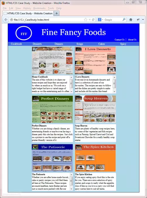
From the C:\_CaseStudy folder, double click on the saved file and it will appear in your default web browser and look something like the following image.
Reviewing The Code
Well we are just wrapping our screenshot images within links so the user can click on them to go to the various sites. Each screenshot is then placed within a table cell and we end up with a grid like the original diagram from Fine Fancy Foods. We use an extra empty table row just to give us a gap between each row of screenshots. For the case study we have just copied the image files sent by Fine Fancy Foods to the HTML Doctor image repository and pasted the text into our paragraphs for each site.
Lesson 5 Complete
In this lesson we have reviewed the proposal and retrieved information to create the main content for the site as requested by the client.
Related Tutorials
HTML Basic Tutorials - Lesson 8 - Links
HTML Intermediate Tutorials - Lesson 2 - HTML Structure - Layout
HTML Intermediate Tutorials - Lesson 6 - An Introduction to Tables
CSS Basic Tutorials - Lesson 8 - Padding & Margins
CSS Basic Tutorials - Lesson 9 - Borders
CSS Intermediate Tutorials - Lesson 1 - Backgrounds
CSS Intermediate Tutorials - Lesson 2 - A Final Look At The Box Model
CSS Intermediate Tutorials - Lesson 8 - Display
What's Next?
In the next lesson we extract the information from the proposal that is relevant to the left sidebar.